Visual stress explained: symptoms, reading difficulties, coloured overlays and tinted lenses, and how an individual assessment can improve reading comfort.
Book a ConsultationCan Coloured Overlays and Tinted Lenses Help Visual Stress?
Visual stress explained: symptoms, reading difficulties, coloured overlays and tinted lenses, and how an individual assessment can improve reading comfort.
Some people find that reading becomes uncomfortable even though their eyesight is perfectly clear. Words may seem to shimmer, blur or move; headaches can develop after reading; bright light or dense pages of text can feel unusually tiring to look at. For some, these symptoms are related to visual stress - a term for the visual discomfort or perceptual difficulties some people experience while reading or looking at certain repetitive visual patterns. It can affect both children and adults, and it can make reading feel unnecessarily difficult even when nothing is technically wrong with the eyes.
One approach sometimes explored for these symptoms is the use of coloured overlays or individually selected tinted lenses. But do they actually help? The honest answer is more nuanced than yes or no - some individuals experience real, repeatable relief with a particular colour, while others notice little or no benefit. Understanding what visual stress actually is, how it differs from other causes of reading difficulty, and why colour selection should always be individualised, is the important part.
What Is Visual Stress?
Visual stress describes visual discomfort or perceptual difficulties that occur when looking at text or repetitive visual patterns, sometimes historically associated with the term Meares-Irlen syndrome. People experiencing it may describe words appearing to move, letters blurring, lines shimmering or vibrating, difficulty keeping their place, headaches, eye strain, light sensitivity, difficulty reading for long periods, or a sense that printed text is simply "too bright." Not everyone with reading difficulty experiences visual stress, and it should never be assumed just because reading is hard.
Visual Stress Is Not the Same as Poor Eyesight
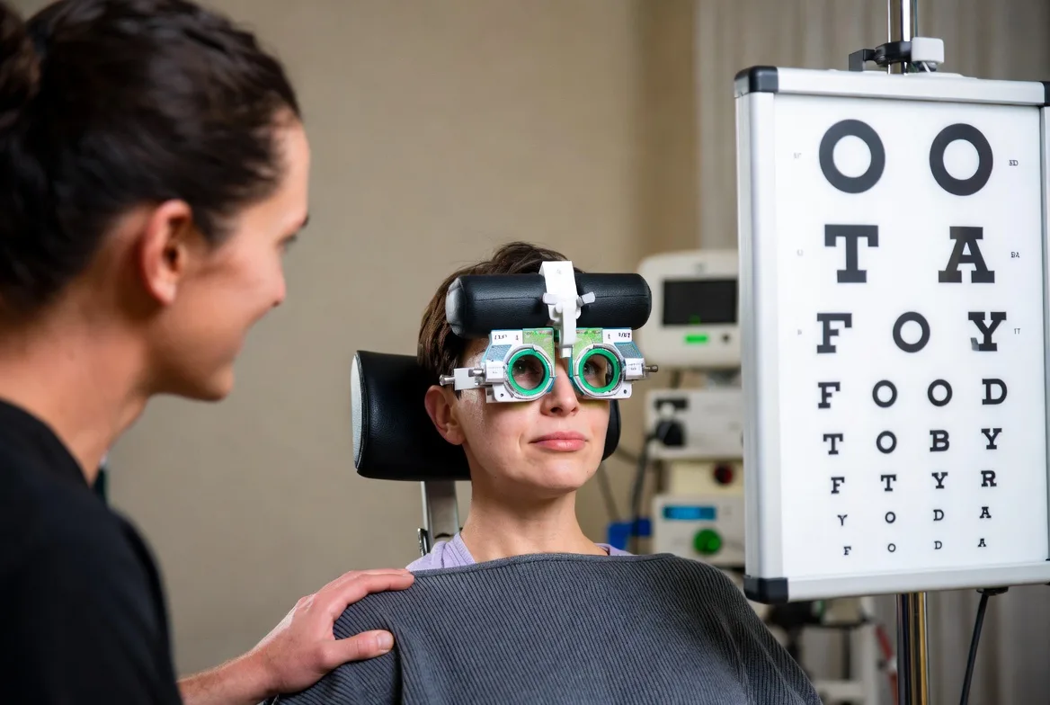
A person can have excellent visual acuity - reading the smallest line on a standard eye chart with no trouble - and still develop headaches, visual fatigue, or discomfort reading black text on white paper. This illustrates an important distinction: visual acuity and visual comfort are not the same measurement. A standard eye examination evaluates how clearly a person sees; a broader functional assessment looks at how efficiently the visual system performs during real reading tasks.
What Visual Stress Feels Like
Descriptions vary widely. Adults might say "the words are moving," "the page looks too bright," or "I can read, but it gives me a headache." Children often describe it differently - "the letters are jumping," "the book hurts my eyes," "the page is too bright" - or may not be able to explain it at all, showing up instead as reading avoidance or reduced reading stamina that parents notice before the child can put it into words.
Why Certain Patterns Can Be Uncomfortable
The visual system is highly sensitive to contrast, repetition and pattern. Printed text is full of repeated horizontal lines and high-contrast edges, and for some individuals, this repetition produces genuine visual discomfort or perceptual distortion. This does not mean the eyes are damaged - it reflects how the visual system and brain are processing that specific kind of visual information.
What Are Coloured Overlays and How Do They Work?
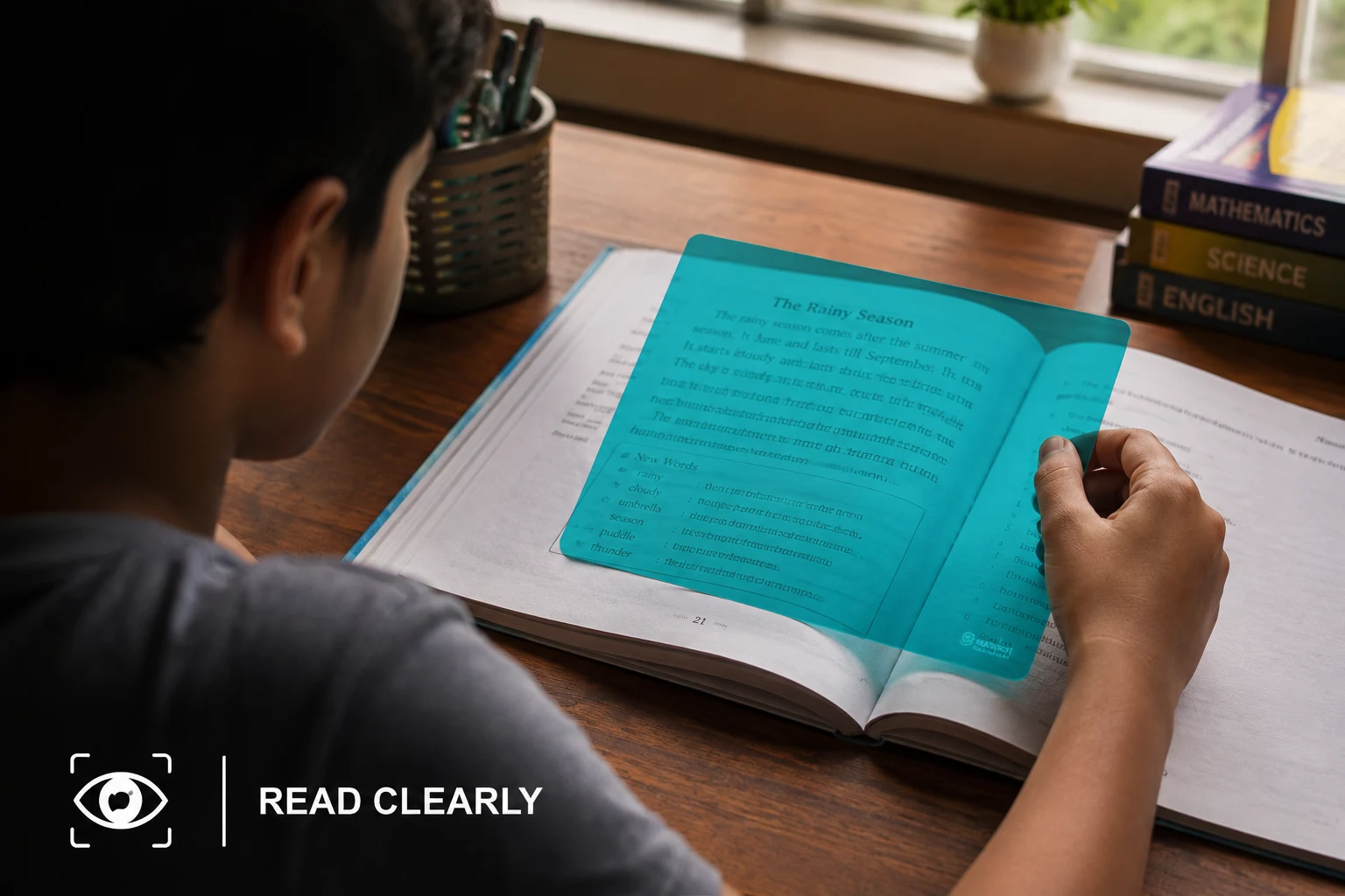
A coloured overlay is a transparent coloured sheet placed over a page of text, changing the visual appearance and wavelength composition of what is being read. Some people report that a particular colour reduces glare, makes text appear more stable, and makes reading less tiring - but importantly, no single colour works for everyone, and the effective colour varies considerably between individuals. The exact mechanism is still being researched; one proposed explanation is that altering visual contrast or spectral characteristics reduces perceptual distortion in susceptible individuals. Coloured overlays are not, and should never be treated as, a substitute for appropriate spectacle correction, binocular vision assessment, evaluation of focusing and eye movements, or educational and learning assessment when indicated.
Why the Colour Has to Be Individualised
There is no universally "correct" colour for visual stress. A shade that feels comfortable to one person can be unpleasant or ineffective for another, and even subtle differences in hue or saturation can change subjective comfort. This is why a proper colour trial involves systematically comparing different colours to see whether a particular tint produces a consistent, repeatable improvement, not simply picking a fashionable shade.
Coloured Overlays vs Tinted Lenses
Coloured overlays are a transparent sheet placed over printed material - easy to try, simple, and useful for comparing colours directly. Tinted lenses incorporate the colour into spectacle lenses, which is more convenient for everyday use, works across different environments, and can be combined with a person's existing prescription. An overlay trial is often the sensible starting point before committing to a more permanent tinted lens.
Can Coloured Overlays Actually Improve Reading?
Some individuals report genuinely less visual discomfort, less perceived movement in text, better reading stamina, and greater comfort with prolonged reading. But feeling more comfortable is not automatically the same as reading better - a person may feel reading is easier without a measurable change in speed, accuracy or comprehension. This distinction matters clinically, which is why both subjective comfort and, where relevant, functional reading performance should be considered when judging whether an overlay is actually helping.
What the Research Says
Evidence on coloured overlays and tints has produced mixed findings - some studies report meaningful subjective benefit for specific individuals, while others find limited or inconsistent effects. Crucially, the evidence does not support coloured overlays as a universal treatment for dyslexia or reading disorders, and clinically responsible practice avoids claims like "this colour cures reading problems" or "every child with dyslexia needs coloured glasses." Colour is best considered one possible component of an individualised plan, used only where the clinical picture actually supports it.
Visual Stress Is Not the Same as Dyslexia
Dyslexia is a specific learning difficulty involving accurate and fluent word recognition, spelling and decoding. Visual stress is a description of visual discomfort or perceptual symptoms during reading. A person can have visual stress without dyslexia, dyslexia without visual stress, both together, or neither - which is exactly why a coloured overlay should never replace appropriate educational or developmental assessment when dyslexia is suspected.
Why a Child With Reading Difficulty Needs a Comprehensive Vision Assessment First
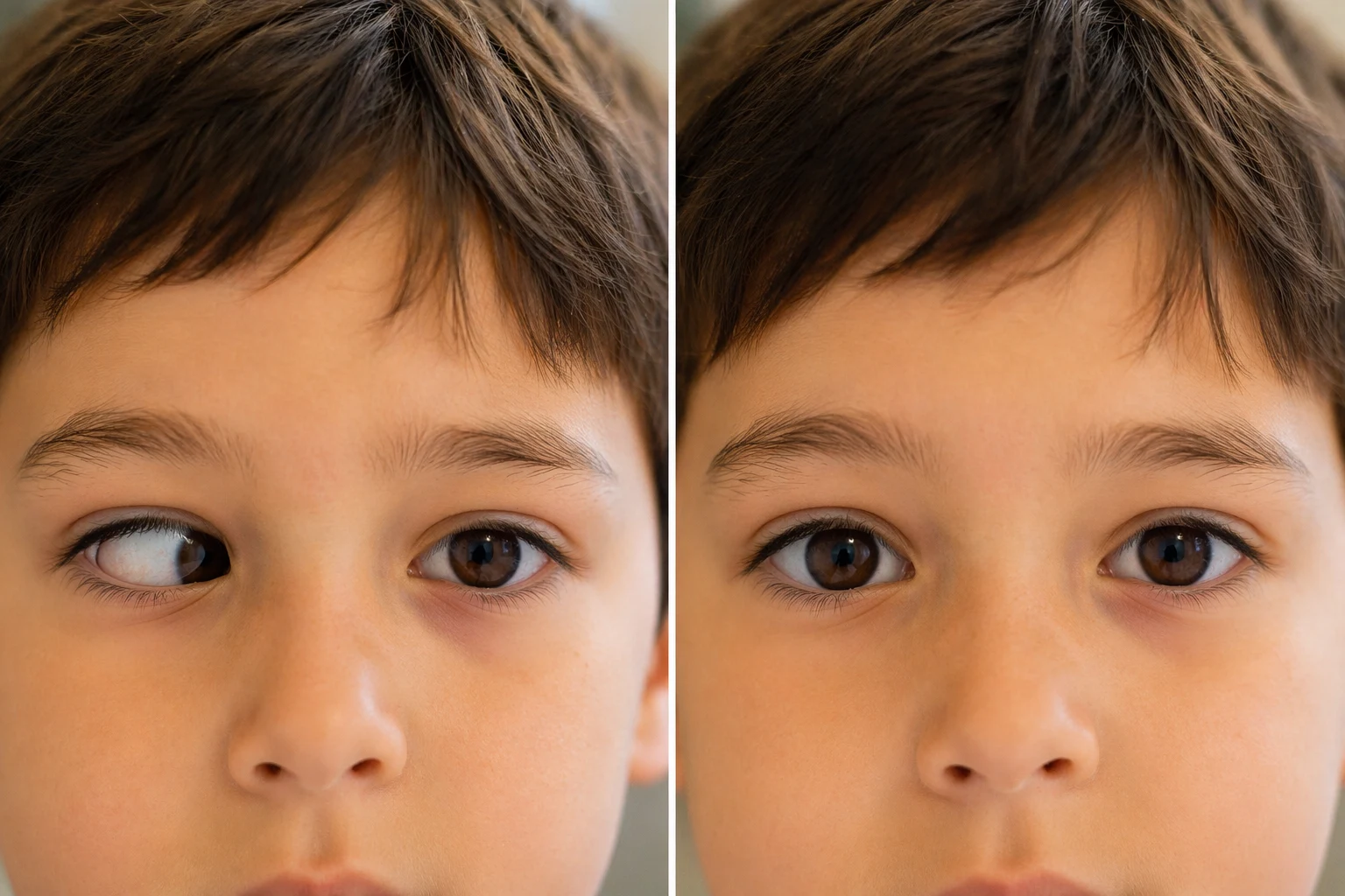
Reading draws on many visual skills at once - clear vision, accurate focusing, binocular coordination, convergence, eye movements, visual attention and visual processing. A child struggling to read might have any one of these problems, an uncorrected refractive error, visual stress, or a learning or language-based difficulty entirely unrelated to vision. These can look remarkably similar from the outside, which is exactly why a comprehensive assessment, not a coloured overlay handed out as a first step, is what actually separates them.
Can Screens Cause Similar Symptoms?
Digital screens add their own visual demands - bright backlighting, glare, reflections, flicker, small text, high contrast, and continuous near focusing. Some people are particularly sensitive to these factors and experience headache, eye strain, visual fatigue, light sensitivity and difficulty concentrating as a result. Adjusting brightness, contrast, viewing distance and room lighting can improve comfort; for people with specific underlying visual problems, further assessment may still be worthwhile.
How Is Visual Stress Assessed, and What Happens During a Colour Trial?
There is no single universal test for visual stress. A comprehensive evaluation typically considers visual acuity, refraction, binocular vision, accommodation, eye movements, reported reading symptoms, sensitivity to specific patterns, and, where relevant, a structured colour trial comparing overlays against a clear baseline. The key clinical question is never "which colour looks nicest" - it is whether a specific colour produces a meaningful and repeatable improvement in comfort or function.
Practical Tips for More Comfortable Reading
Regardless of whether visual stress is present, a few habits generally help: take regular visual breaks, keep a comfortable reading distance, reduce glare, keep screen brightness reasonably matched to the surrounding environment, use comfortable text size and spacing where possible, maintain good posture, and make sure any needed vision correction is up to date. Persistent headaches, blurred vision, double vision, or significant reading discomfort are not something to simply push through - they deserve professional evaluation.
When Should You Seek Professional Help?
Consider a comprehensive vision assessment for headaches while reading, eye strain, words that appear to move, difficulty keeping your place, discomfort with dense text or bright light, difficulty reading for extended periods, frequent eye rubbing, reading avoidance, or notable fatigue during near work or computer use. If reading difficulty is affecting academic performance, an educational assessment alongside the vision evaluation is important too.
At Caring Vision, we look at the complete visual picture rather than reaching for one symptom-led fix. The goal is never simply to make a page look different - it is to help you or your child see, read and function as comfortably and efficiently as possible. If reading has quietly become uncomfortable, book a comprehensive vision assessment to find out what is actually behind it.
Explore More at Caring Vision Therapy
Frequently Asked Questions
What is visual stress?
Visual stress describes visual discomfort or perceptual symptoms that may occur during reading or exposure to certain repetitive visual patterns.
What are common symptoms of visual stress?
Symptoms may include headaches, eye strain, visual discomfort, light sensitivity, difficulty reading, or the perception that words move, shimmer or blur.
Do coloured overlays help visual stress?
Some individuals report improved visual comfort with a particular coloured overlay, but the response varies considerably and research findings are mixed.
What colour overlay is best for visual stress?
There is no single best colour for everyone. The preferred colour can vary between individuals and should ideally be assessed systematically.
Can coloured overlays cure dyslexia?
No. Coloured overlays should not be considered a cure for dyslexia and should not replace appropriate educational assessment or intervention.
Are tinted lenses better than overlays?
Not necessarily. An overlay can be useful for trialling whether colour changes visual comfort. Tinted lenses may be more convenient for individuals who demonstrate a consistent benefit.
Should I get an eye test if reading causes headaches?
Yes. Persistent reading-related headaches or visual discomfort warrant an appropriate eye and binocular vision assessment to determine whether refractive, focusing, binocular, ocular-motor or other factors may be contributing.